Connecting Old and New
Location: Northern Tel Aviv
Property: a 140 sq.m. garden apartment with a 100 sq.m. garden
Owners: a couple in their 50s with 4 children, two of which are still at home
Design and Styling: Meital Zimber
Photography: Eran Gur
After 25 years, a couple in their 50s decided that the time had come to renovate their garden apartment and adapt it to their new needs. They turned to interior designer Mittal Zimber after visiting the house she designed and falling in love. She now shares how she planned and designed their apartment
The phase when the children grow up and leave the nest is often the time when many parents recalculate a new path and choose to adapt the beloved living environment, which has served the family for decades, to the new reality.
This is also the case with couples in their 50s who have 4 children – two of whom have already left home, while the teenage daughter and their soldier son (who comes on short vacations from time to time) still live with them.
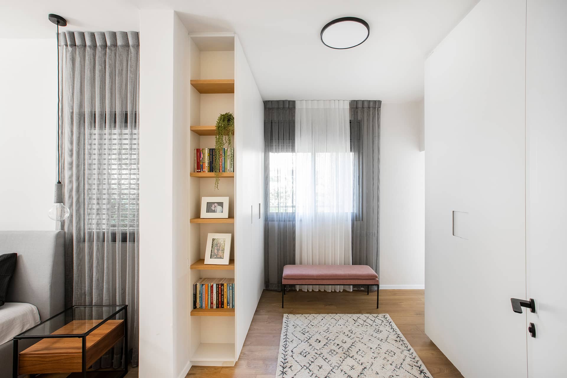
"The house was completely renovated, but the main change in the layout was made on the top floor, the room floor, where we turned four bedrooms into two spacious suites – one for the teenage daughter and the other for the parents,"recalls Zimber.
"The public wing was renovated and upgraded but remained the same in terms of locations and functions. The bedroom of the soldier's son on the ground floor was also renovated, and the study was converted into a craft room and is mainly used by the mother of the family who is an amateur artist.", adds Zimber.
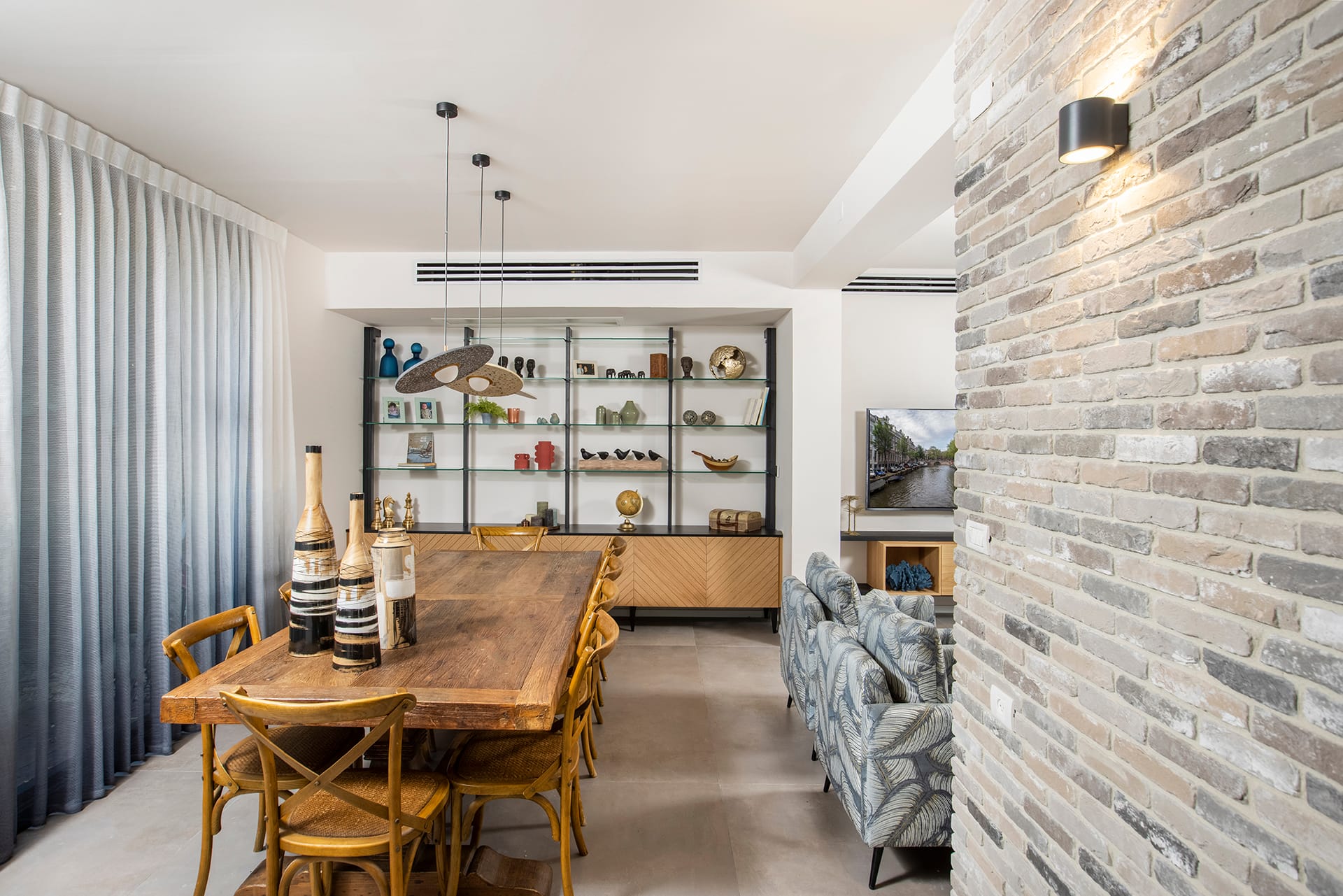
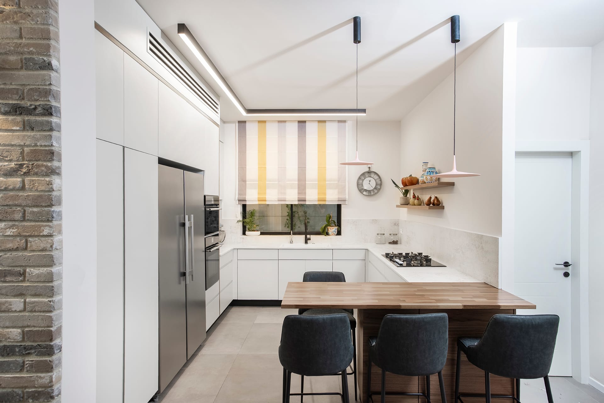
"The couple often host, so it was important for them to create an inviting space with clean lines, in which wooden elements and items are combined to provide warmth. They were also looking to create as many storage spaces as possible and we did put some thought into practical solutions in each of the spaces.", says Zimber. "The desire of the family members to renovate turned the apartment into a smooth canvas. However, there was one element that stood out very much in the apartment before the renovation and which I fell in love with at first sight, so we decided to keep it: this is the dining area that serves as the thread connecting the old and the new."
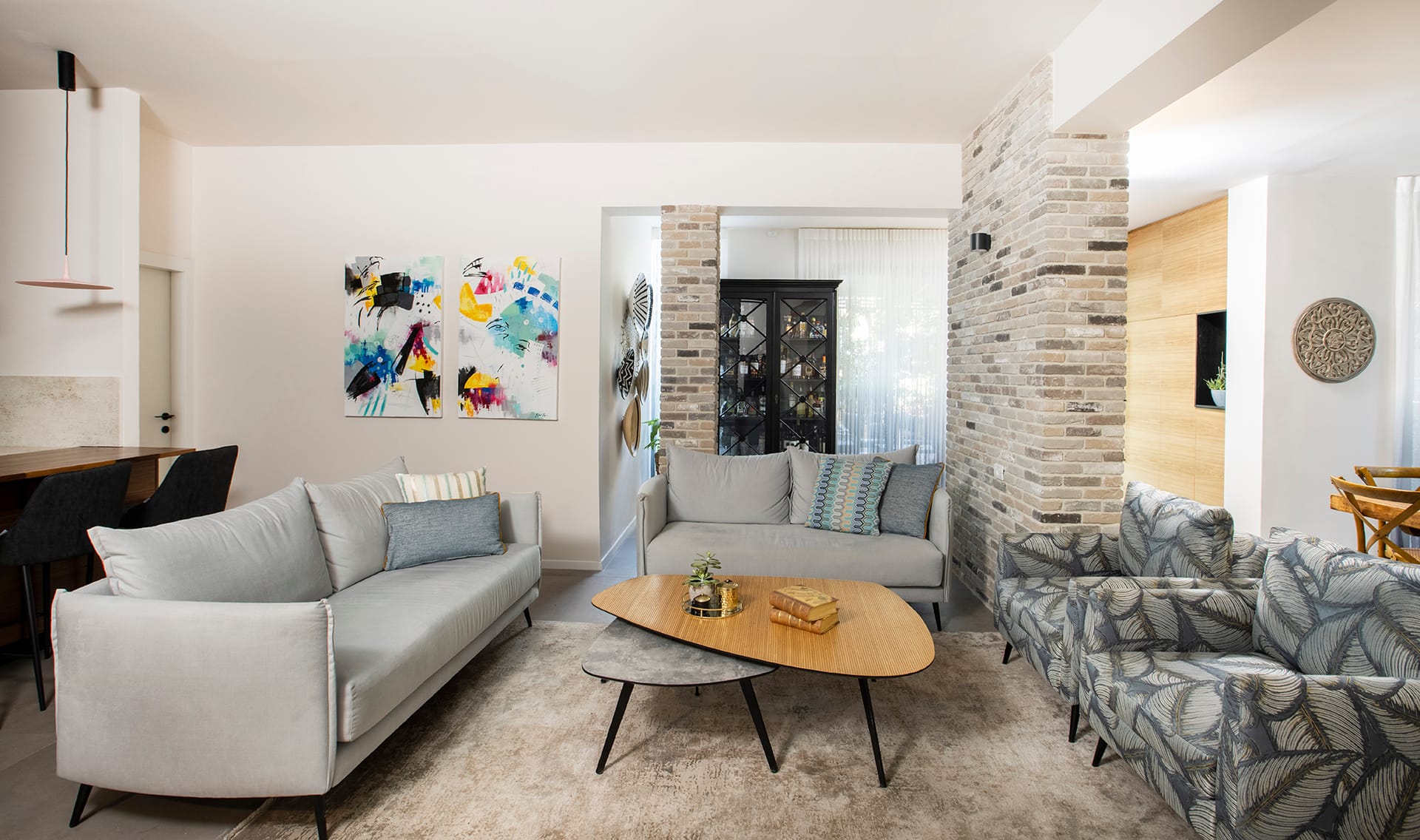
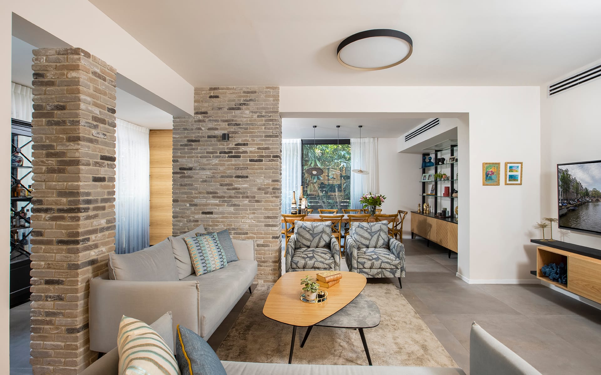
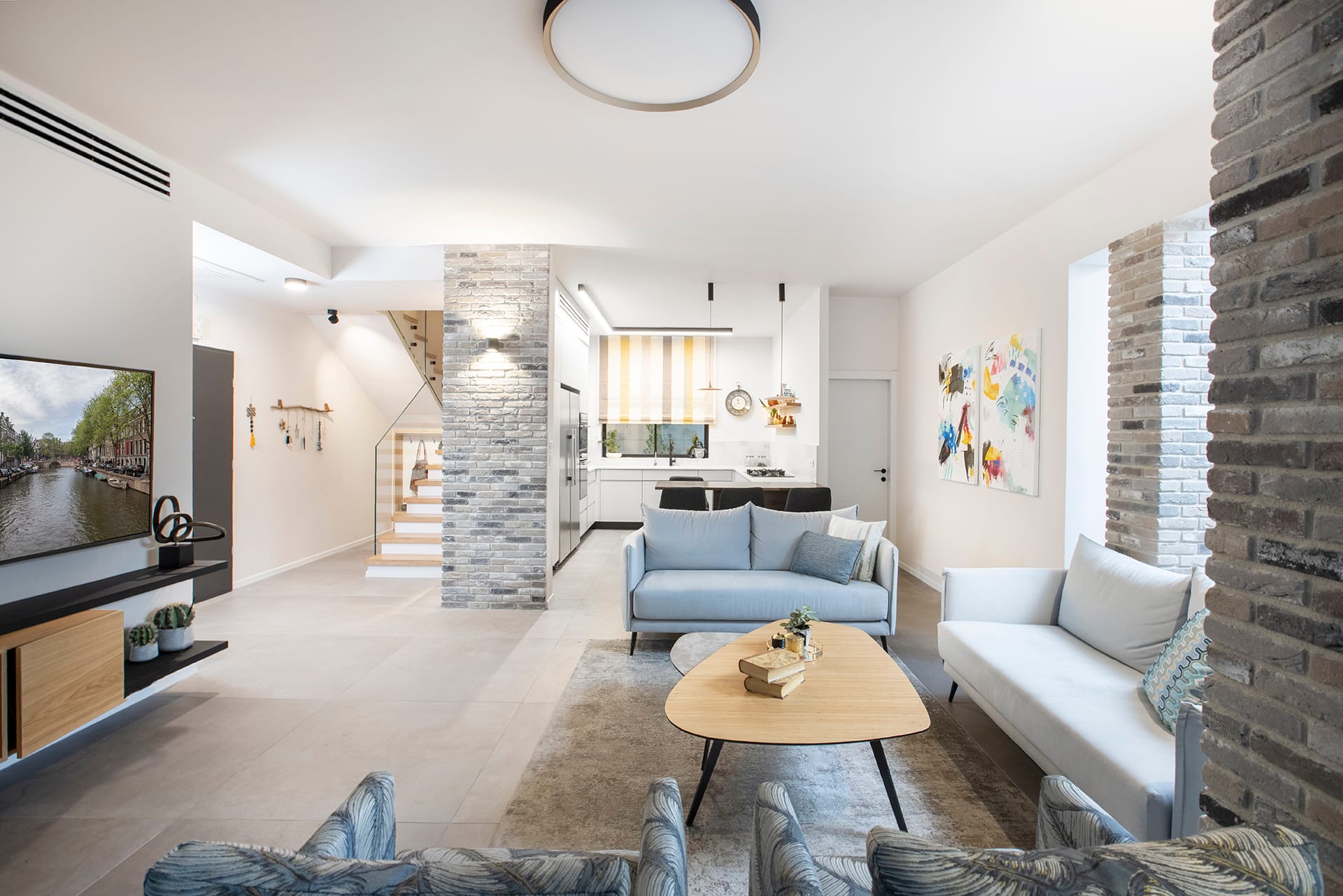
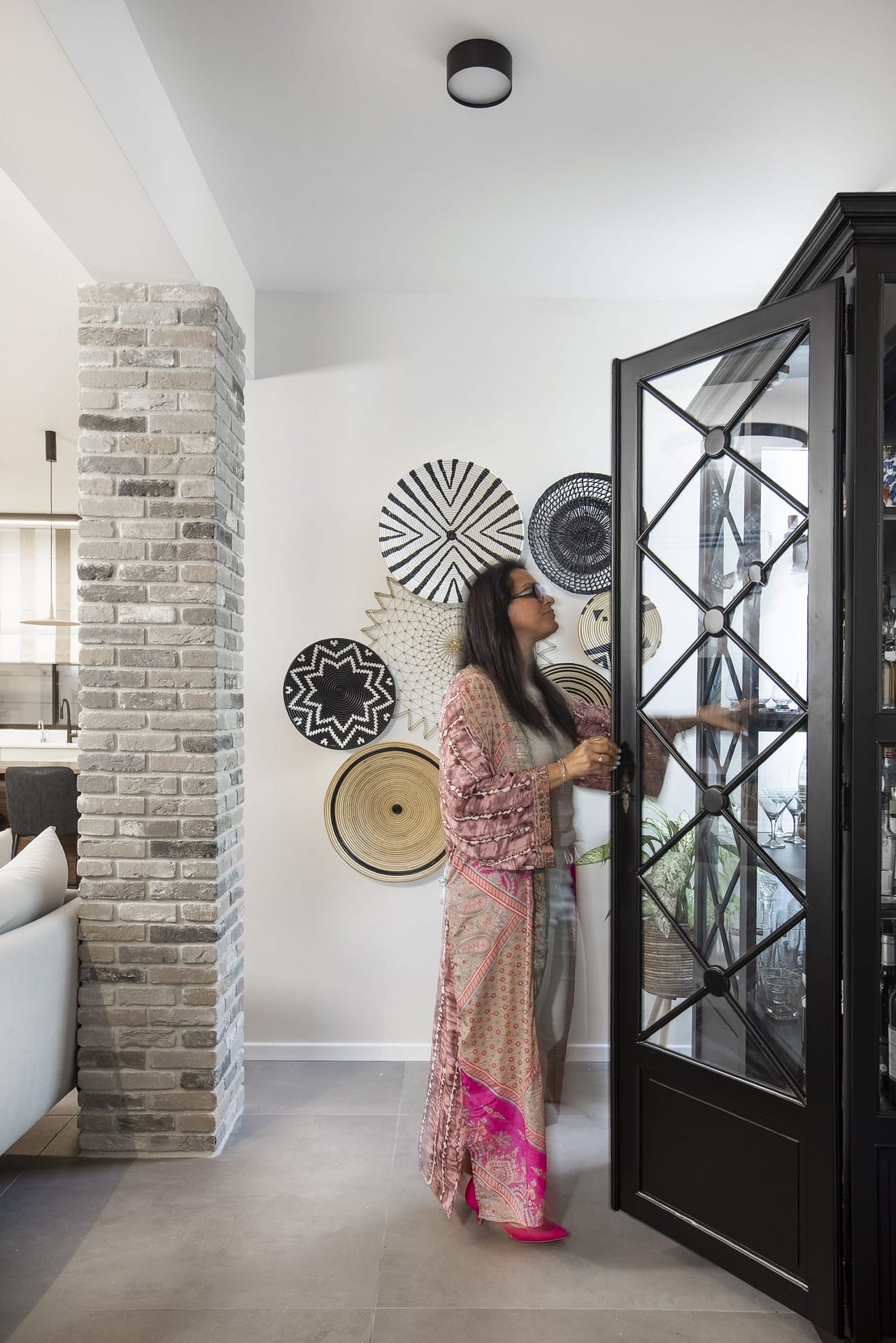
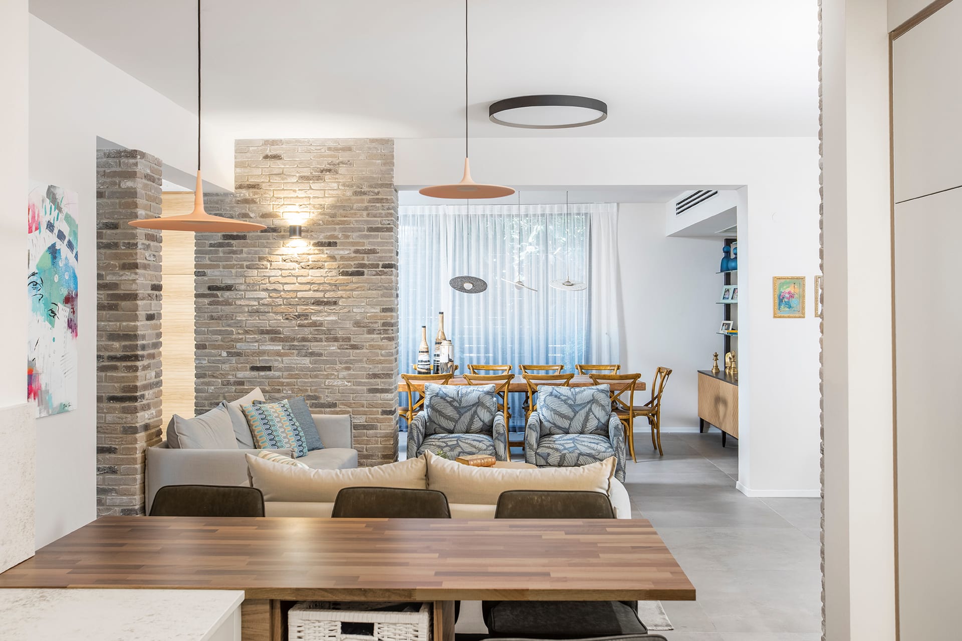
Indeed, the combinations between old and new and warm and cold are very evident throughout the apartment, especially with regards to materials, textures and colors. For example, the bricks used by Zimber to cover the entrance wall and the structural columns in the living room area.
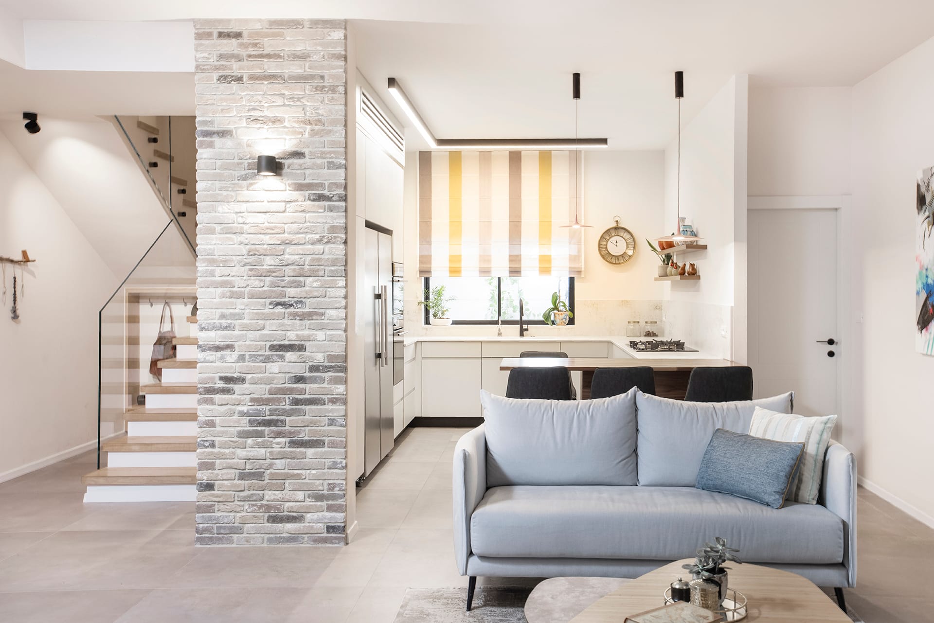
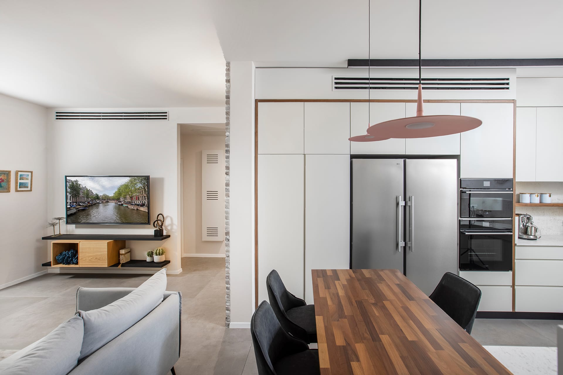
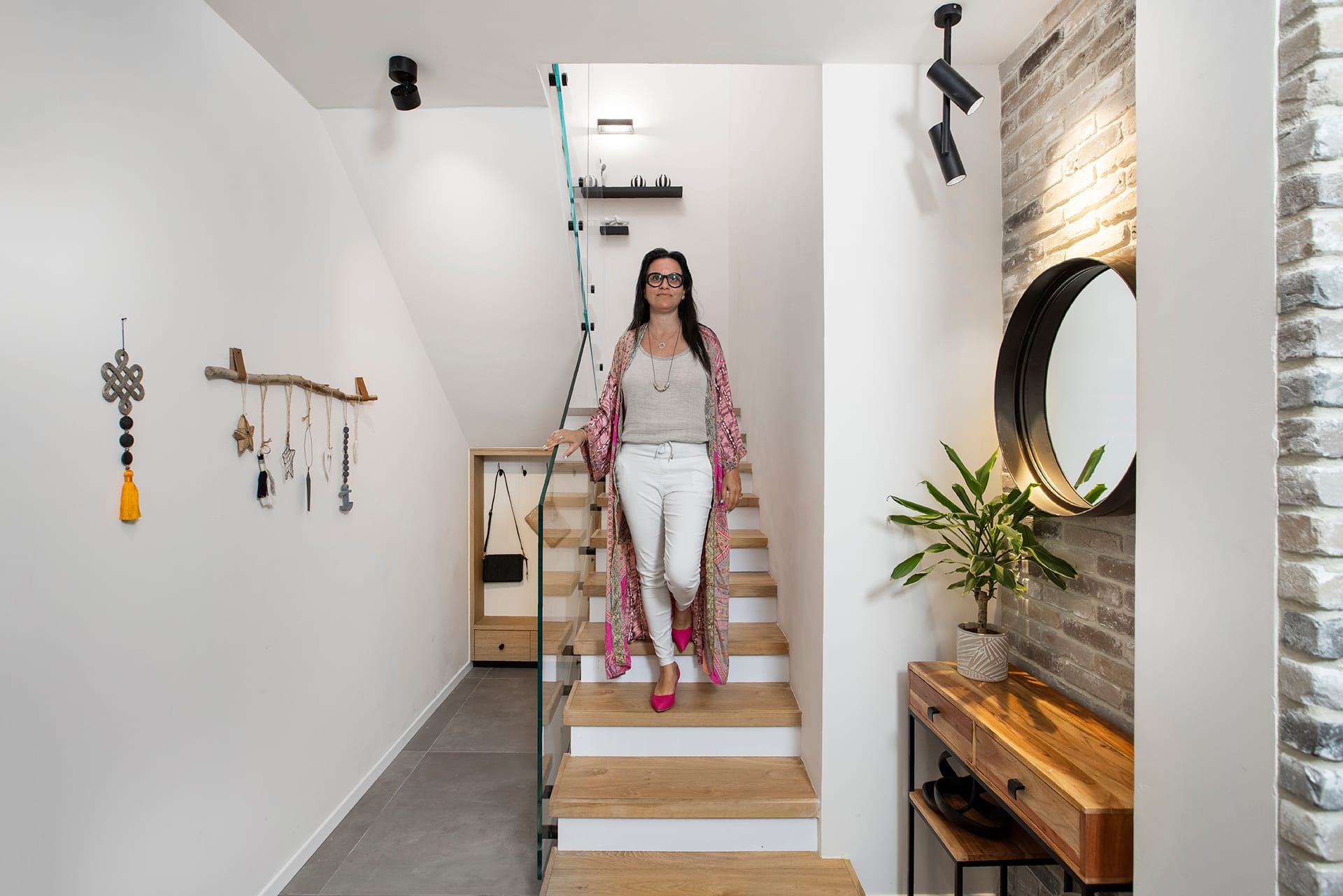
"The desire to create a very warm house led us to use bricks, which we placed in a random layout and as organic and natural as possible, and an abundance of wooden products and items such as a smoked oak floor (a material we also used to cover the stairs), a walnut counter in the kitchen and slotted wooden doors in the libraries." The textures and colors were also carefully chosen and next to smooth monochromatic elements we combined elements that bring a lot of character and interest to the different spaces. We used a pleasant and calm color palette of pure grays, blues and browns but the use of different tones of these colors, some of which are more powerful than others, made the design better-layered. Next to smooth and elegant fabrics I combined prints that introduce a slightly more wild and playful side. Another element that adds character to the public space are two colorful works by the artist Efrat Ilan that we placed in the living room."
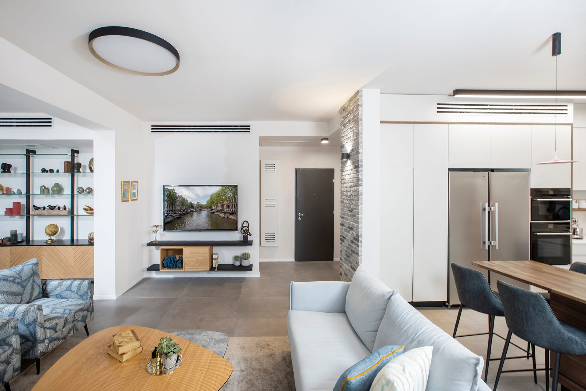
Although the functions in the public wing remained the same, Zimber has carefully redesigned the location of the furniture in the living room, so it is now more effective: "I changed the position of the television, which was relocated to a smaller wall, and thus the sofa stands parallel to a large wall, which gives the space a more open and airy appearance.
The area behind the sofa wasn't previously used and there we incorporated an old wine cabinet that was renovated and painted black." A solid wood dining area, which has accompanied the couple for nearly 20 years, was incorporated into the new design: "it fits like a glove into the style and concept of a home where guests are often entertained. Similarly, the wooden chairs that surround it, which were renovated some five years ago, remain beautiful, so we kept them too. Nearby is a library that we custom-made of iron construction, glass shelves and oak doors carved with a geometric pattern in the lower part. This is where the service, utensils and maps are stored while the upper part is used to display beautiful dishes and sentimental collections".
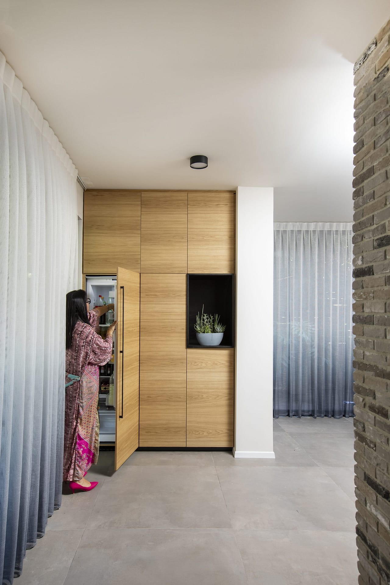
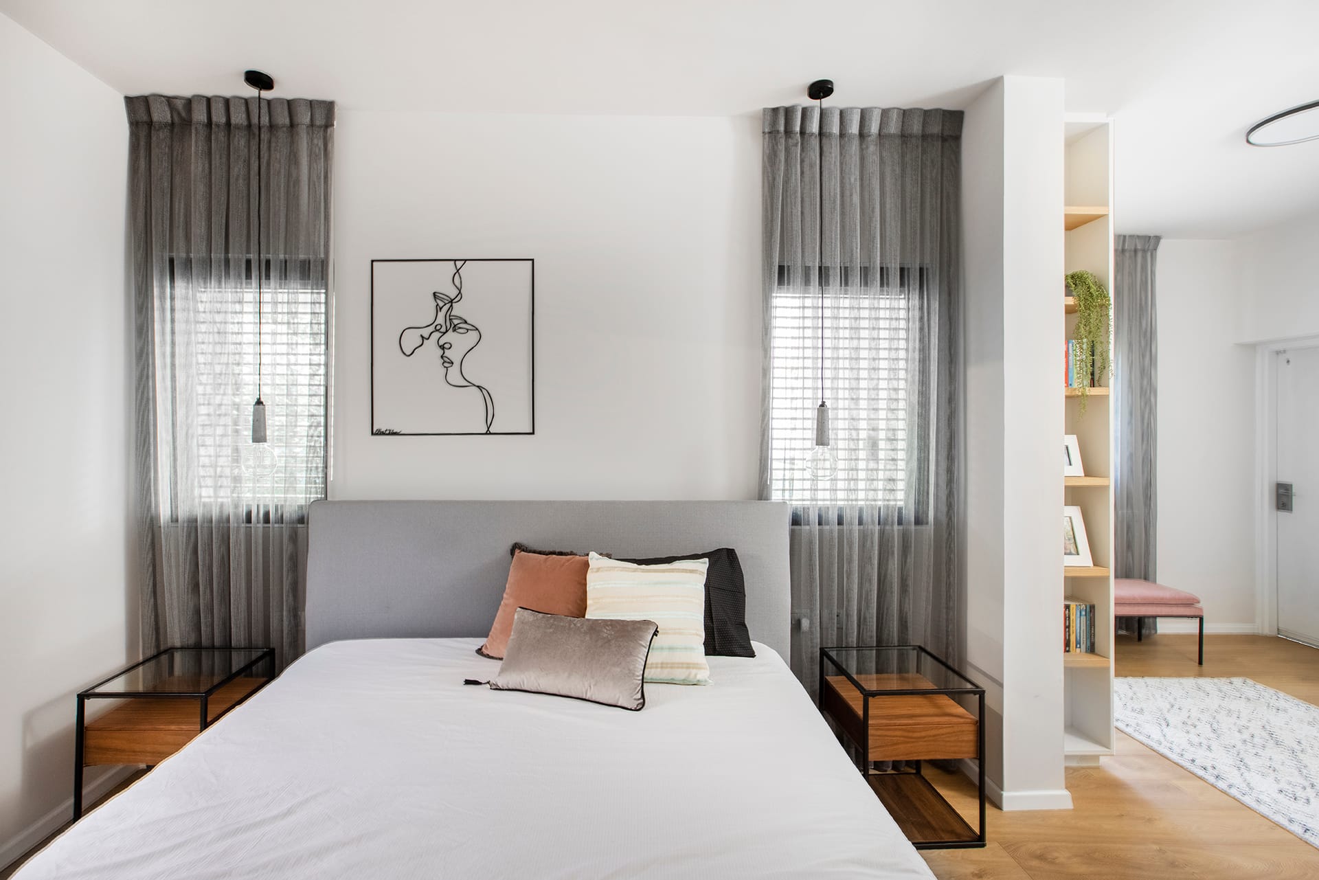
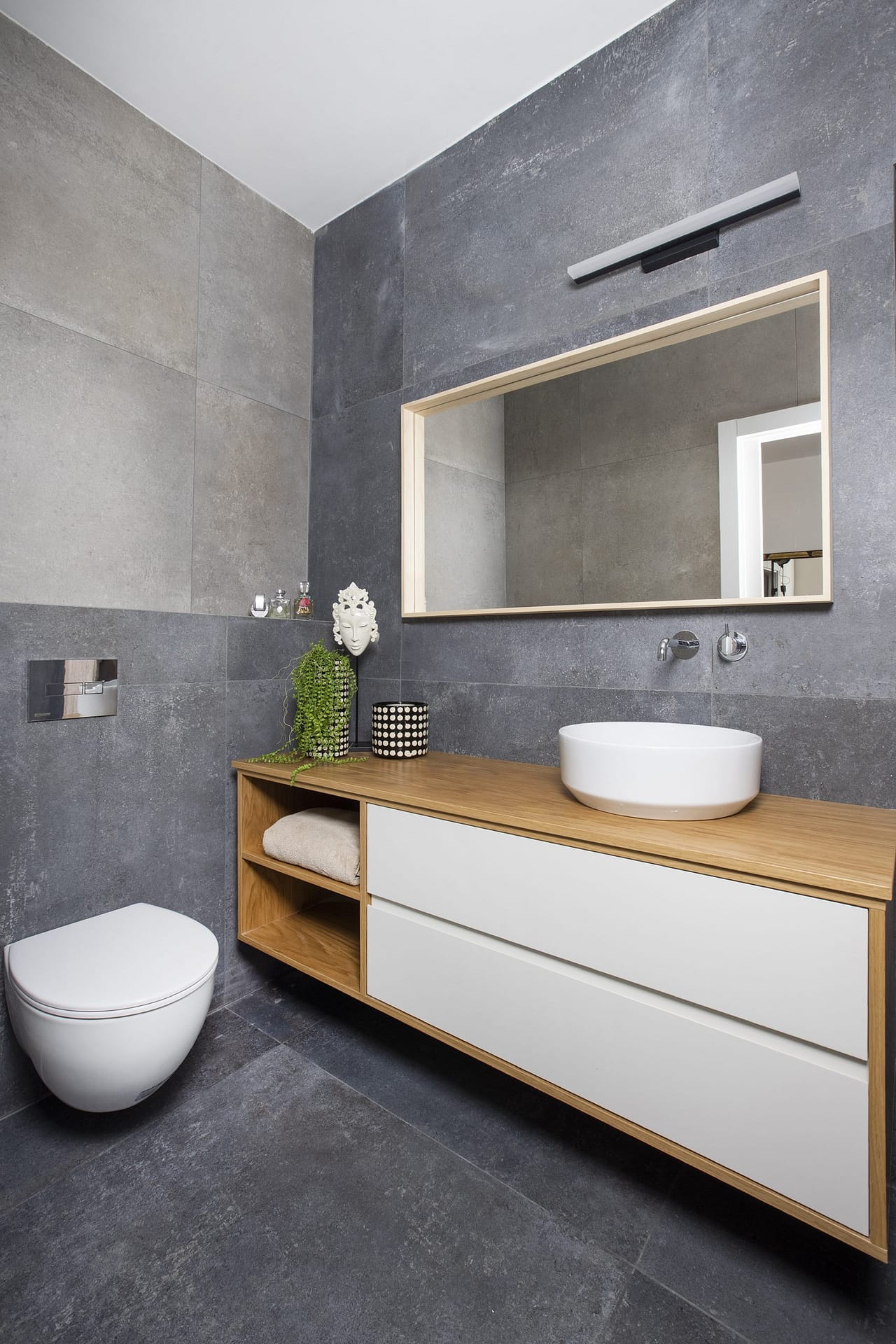
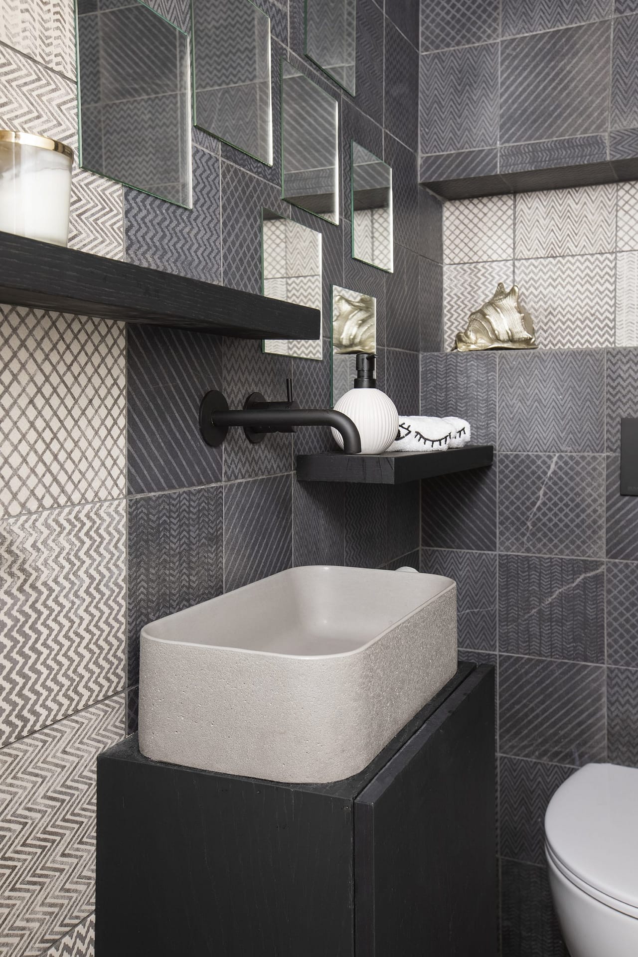
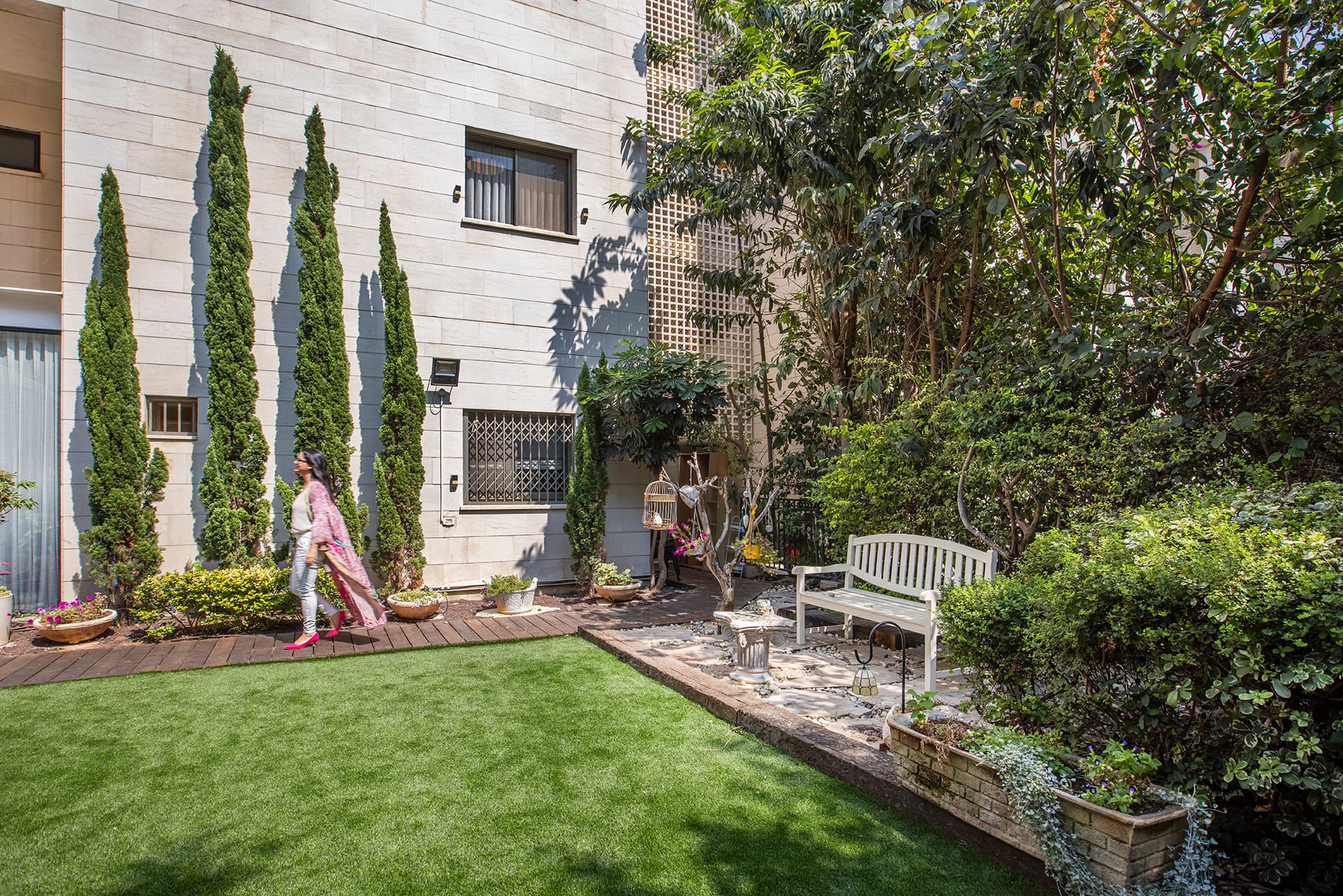
The guest toilets, which are also located on the entrance floor, are the area where the designer could go wild: "I chose to cover the walls with black and gray tiles measuring 20×20 cm, on which geometric patterns are printed. We spread them in an unconventional layout and hung blackened oak floating shelves on their backs that intensify the drama in the space even more." Near the exit to the garden, Zimber planned a place for an integral refrigerator, in addition to the one in the kitchen, which is used by family members, especially when they host outside. "The garden itself has been comprehensively renovated. We kept the existing pergola but added a new deck and invested in gardening so that the entire area is painted green. A fully equipped outdoor kitchen, dining and sitting areas, and a TV screen where you can watch movies and sports events in the evening await family and guests. The bathrooms in the bedroom suites on the room floor were designed with elegant, modern and clean lines and are covered with large tiles. For the bedrooms, a relaxed and calm color palette was chosen around white, cream with grayish touches in textiles, hints of pink and coffee and wooden items. "The parents' bedroom is entered through the couple's closet and dressing room. In front of the bed, a large wall cabinet was designed, which increases the storage space even more, and where the TV screen is nested.", summarizes the designer.
